Dashboard
Overview
Modeloptic's Dashboard page gives you the power to create a customizable set of reports, enabling you to analyze and communicate your company's performance and future plans both internally and externally.
The Dashboard page and the Reports page are similar in that you can make use of the same report objects in each place (graphs, Data Tables, variance objects, etc). The main difference is that the Dashboard page uses a free-form layout intended for live viewing within the browser, whereas the Reports page organizes report contents into pages and is intended for creating deliverable reports in PDF format. To learn more about the Reports page, see the Reports section of this guide.
When you navigate to the Dashboard page, you'll start by seeing the Core Financials preset report, which will look something like this:
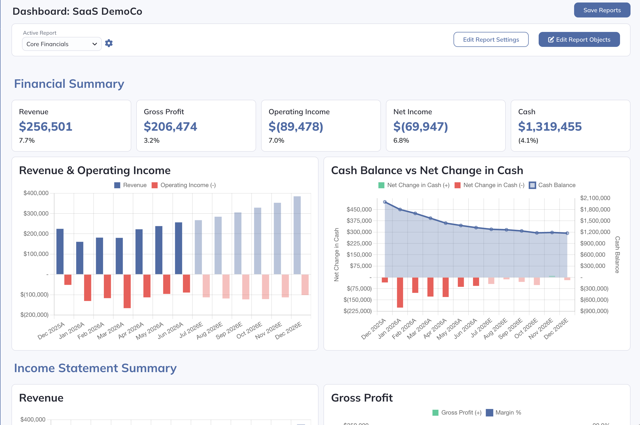
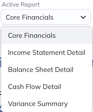
Several additional preset reports are available from the "Active Report" dropdown in the top left:
If you click on the gear icon to the right of the report selector, you will see the report management screen that gives you the ability to rename, reorder, clone, or delete existing reports. You can also create a new report either from a preset or starting from a blank page:
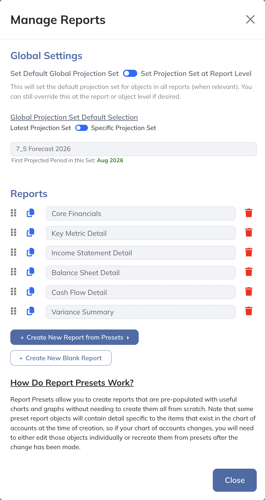
You are free to edit the existing reports as desired. If you'd ever like to get the initial version of these pre-created reports back, you can always do that by using the "Create New Report from Presets" menu.
Global & Report-Level Projection Sets
Many objects in your reports will contain projected values. Modeloptic allows you to create multiple Projection Sets, so instead of needing to indicate which Projection Set you'd like to use for every object, Modeloptic allows you to set a default Projection Set. You can set a default Global Projection Set (meaning a Projection Set that will apply to all reports), and this Global Projection Set can be overridden at the report-level if desired. Then within each report object, you can choose to use the report-level Projection Set or override it to use a different one if you'd like.
To set a default Global Projection Set, you can do that in the same "Manage Reports" screen that we opened above:
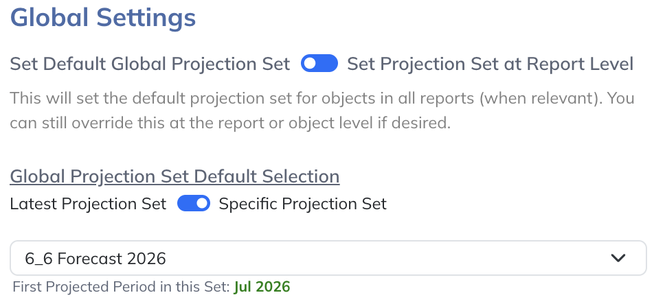
The first option shown is a toggle between "Set Default Global Projection Set" and "Set Projection Set at Report Level". If you select "Set Default Global Projection Set", you'll then be able to choose from the "Latest Projection Set" or "Specific Projection Set" options.
Within a given report, clicking on the "Edit Report Settings" button near the top right will open up the following screen:
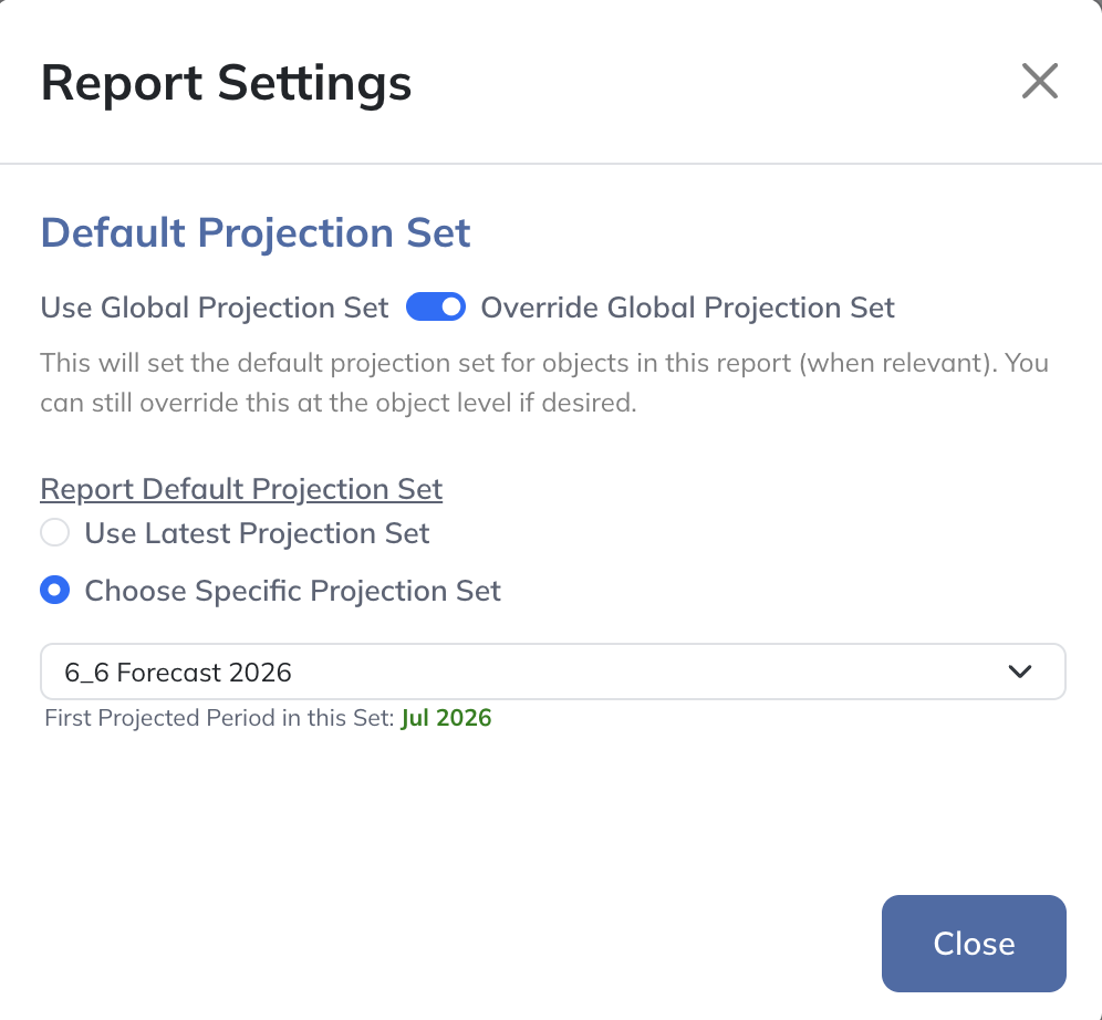
This is where you can set the default Projection Set for the active report. If you'd like to just use the Global Projection Set as the default for the objects in this report, you can do that by selecting the option for "Use Global Projection Set". If you'd like to override the Global Projection Set for this report, you can select the "Override Global Projection Set" option and then choose a different Projection Set.
Finally, when editing a report object that contains projected values, you'll see the following section within the object's edit panel:
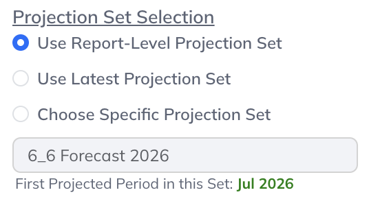
The same concept applies here: If you'd like to use the report-level Projection Set for this object, the "Use Report-Level Projection Set" option will be selected by default. If you'd like to override the report-level Projection Set for this object, you can select one of the other options.
Report Objects Overview
The "Edit Report Objects" button in the top right will let you edit, resize, reposition, clone, and delete objects within the active report:

When in Edit Mode, clicking on any object will show that object's configuration options in the left panel:
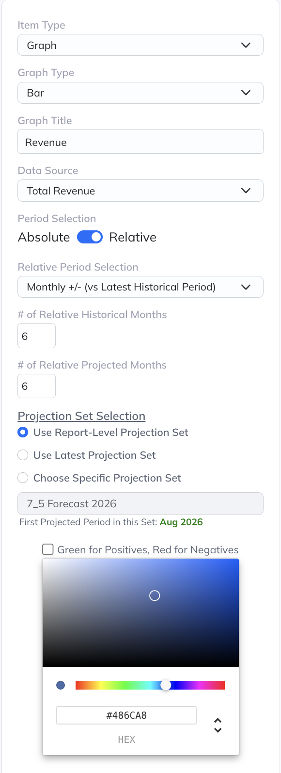
A variety of object types are available to add to your reports, including:
- Graphs
- Data Tables
- Variance Objects
- Stagger Charts
- Text Objects
- Data Tiles
This is also where you can select a specific Projection Set for the object you're editing using the Projection Set Selection option.
Creating & Deleting Objects
If you scroll to the bottom of the active report, you'll see options for adding new objects to it:
You can either create a new blank object or start with a preset object. Utilizing our collection of presets is very convenient so you don't always have to create your own graphs or Data Tables from scratch, though you have the ability to customize them to suit your needs.
If you scroll to the bottom of the left edit panel, you'll see the following buttons:
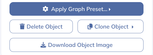
Clicking the "Clone Object" button is another way to create a new object from an existing one, which you can then modify. Clicking this button will allow you to select which report you'd like to clone the object into. The "Delete Object" button is how you can remove objects from your reports.
The "Apply Graph Preset" button will show you the available preset options for the selected object type:
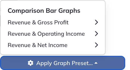
Selecting one of the presets from this menu will overwrite whatever settings you currently have for this object.
The "Download Object Image" button allows you to download a PNG image of the object. This can be very useful for incorporating report objects into external documents. Hovering over an object will also show a download icon on the top right of the object.
Repositioning & Resizing Objects
Objects are easily moved via click & drag:
Resizing objects can be done by clicking & dragging the bottom right corner of the object:
Objects can be dragged downward at the bottom edge of the report to create additional space:
Object Period Selection
Graphs, Data Tables, Variance Objects, and Data Tiles all use a similar mechanism for choosing which period to show. Any of them can be defined using either the "Absolute" or "Relative" methods:
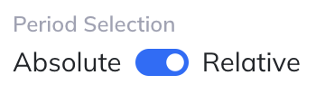
Relative selections advance as the Latest Historical Period changes. Use them for reporting that should follow the latest actuals without selecting new dates for every object.
With this option selected, you'll then be presented with additional options:
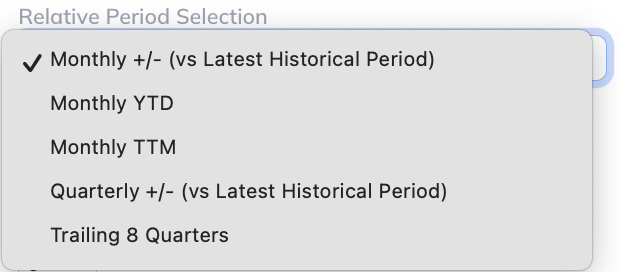
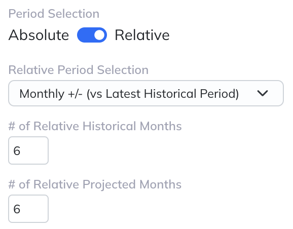
These options will vary based on the object type. If you choose either the "Monthly +/-" or "Quarterly +/-" option, you'll see additional inputs to define how many periods backward and forward from the latest historical period you'd like to show:
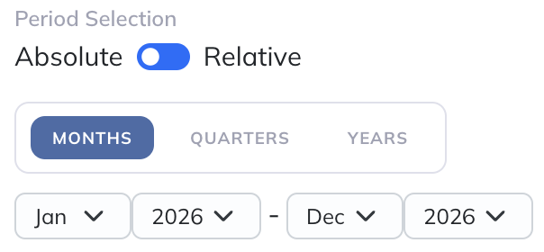
Using the "Absolute" period selection lets you choose a particular date range:
Graphs
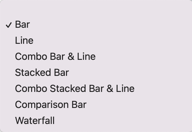
When making a graph, you have several graph types to choose from: Bar, Line, Pie, Combo Bar & Line, Stacked Bar, Combo Stacked Bar & Line, Comparison Bar, and Waterfall.
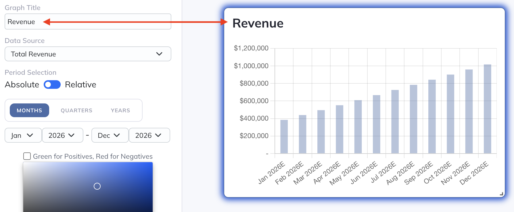
The "Graph Title" field is where you can specify the top title on the graph:
Most graph types will allow you to change the color of the data items to whatever you'd like:
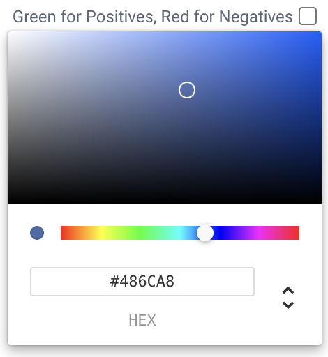
For some data sets, you can set positives to green and negatives to red by checking the box next to "Green for Positives, Red for Negatives", which is particularly useful for showing profitability metrics.
Bar Graph
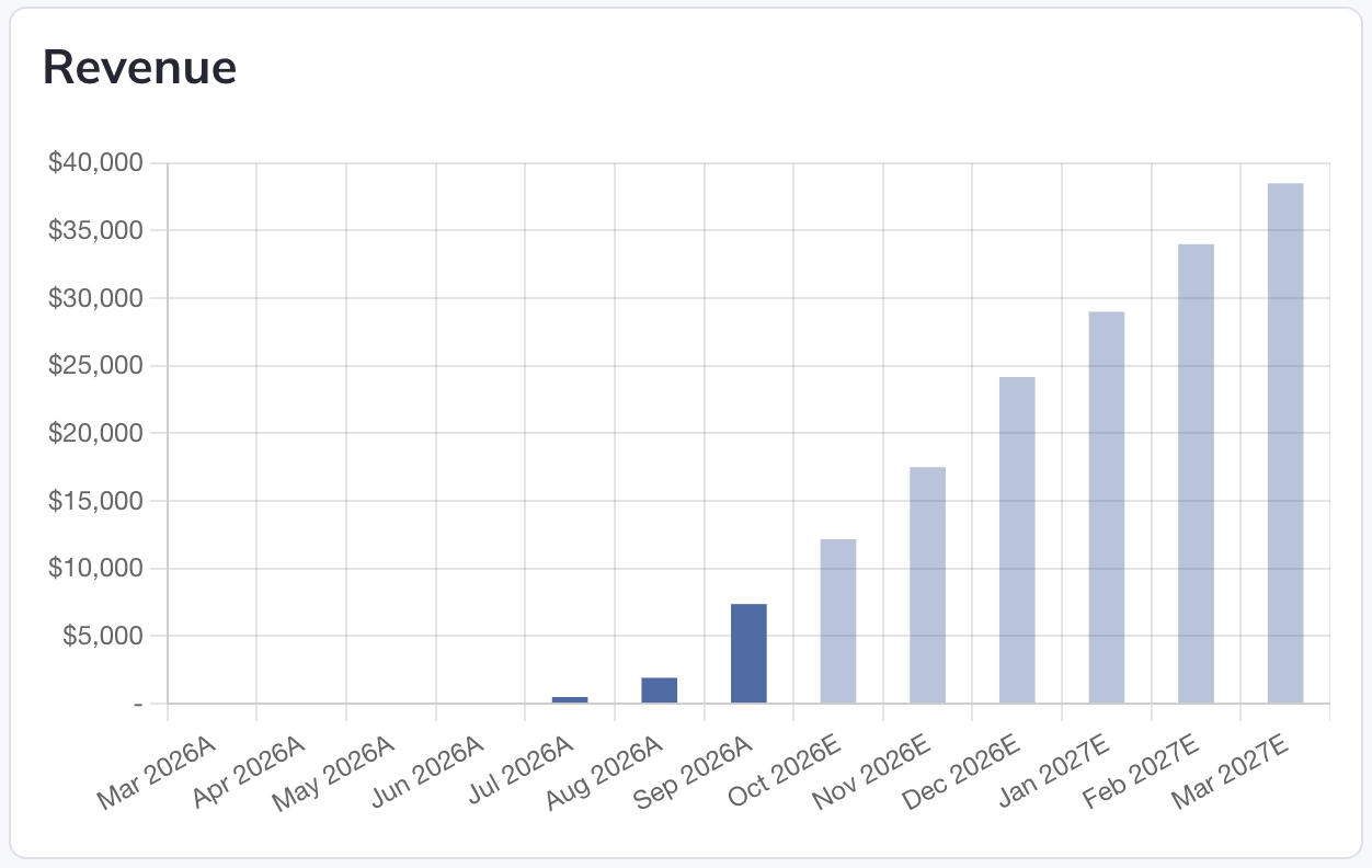
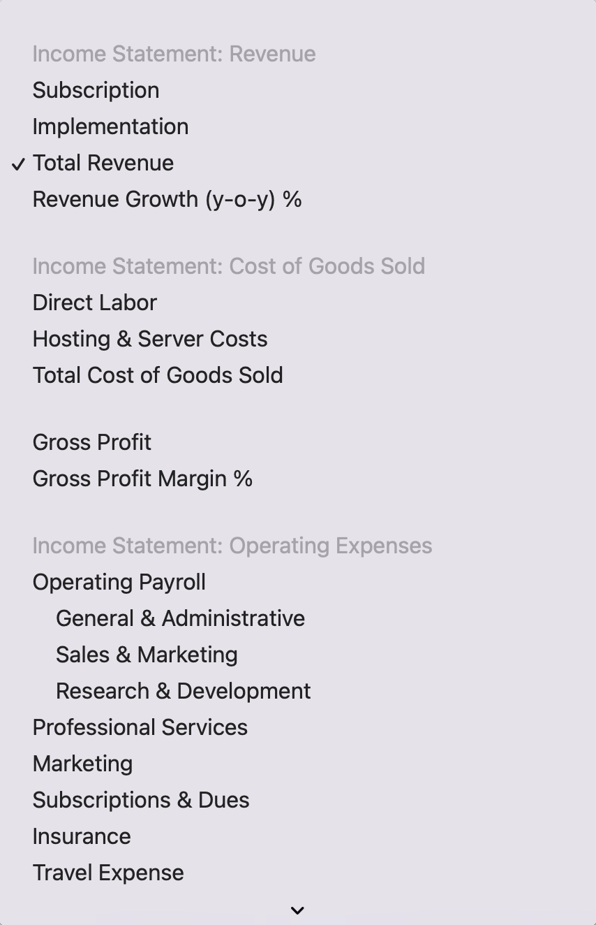
Bar graphs allow you to select a single data source from the "Data Source" field. Choose an eligible source from financial statements, global Views, global Logic Rows, or global Collection Tables, subject to your permissions.
Periods and bar colors can be customized as described above.
Line Graph
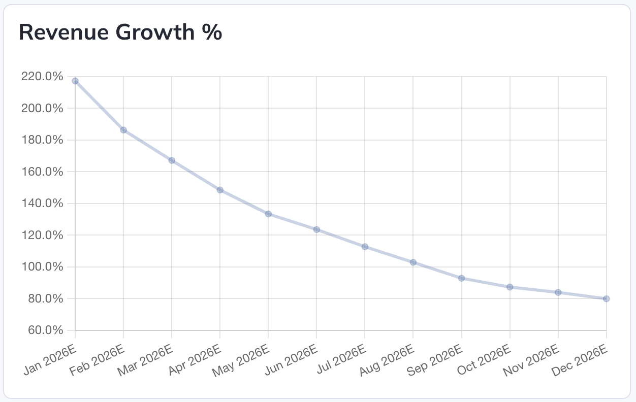
Like bar graphs, line graphs allow you to select a single data source from the "Data Source" field, and periods and line color can be customized as described above.
Combo Bar & Line Graph
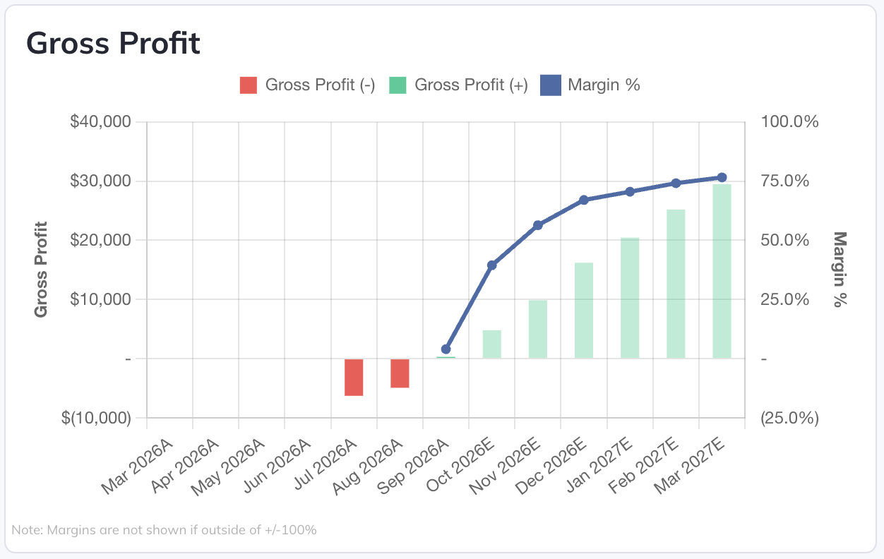
This graph type allows you to select two data sets that overlay each other. Two data sources, color options, and data set titles must be set.
Stacked Bar Graph
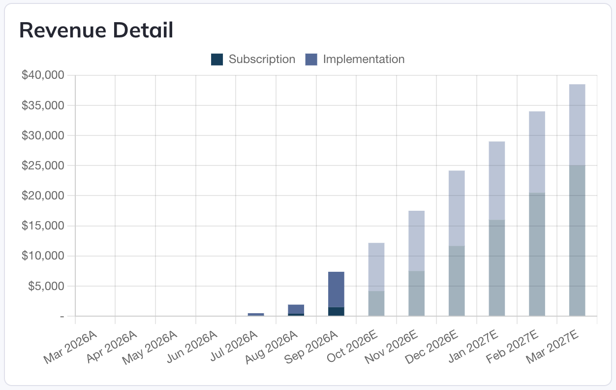
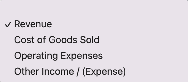
This graph type allows you to see the components of a given piece of data that sum to a total. A handful of data options are available to select:
Combo Stacked Bar & Line Graph
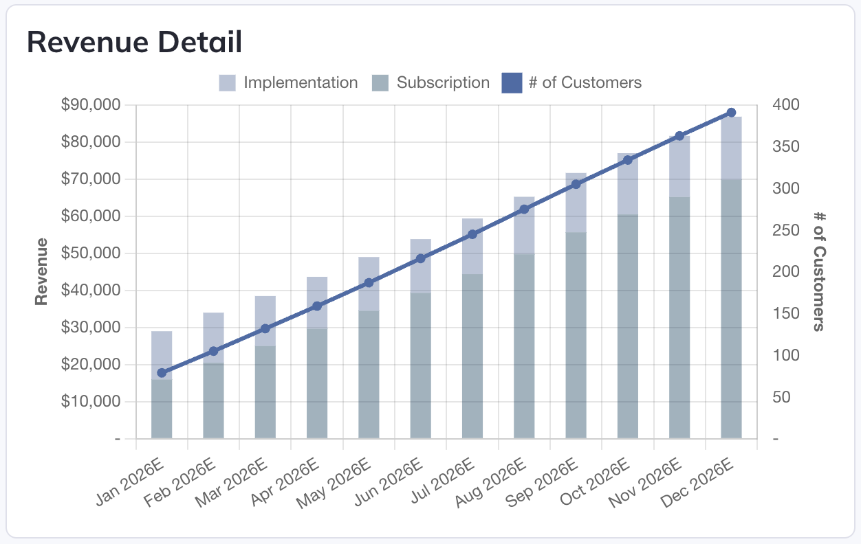
Same as the "Combo Bar & Line Graph" type above, except the bar data set will show component data as it does for the "Stacked Bar Graph" above, with the same options available for selection.
Comparison Bar Graph
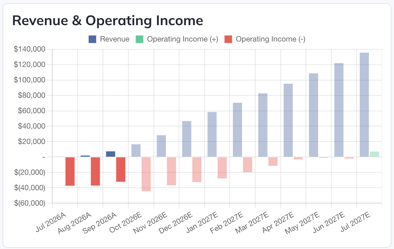
This graph allows you to select two data sources that will be shown as two side-by-side bars for each period.
Waterfall Graph
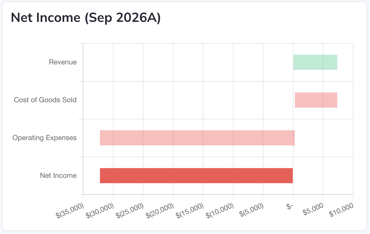
This graph will show all constituent components of either Net Change in Cash or Net Income for the chosen period.
Data Tables
A reporting Data Table displays model values from eligible financial statements, global Views, global Logic Rows, and global Collection Tables. It is a report object, separate from a Collection Table used to model a list of items:
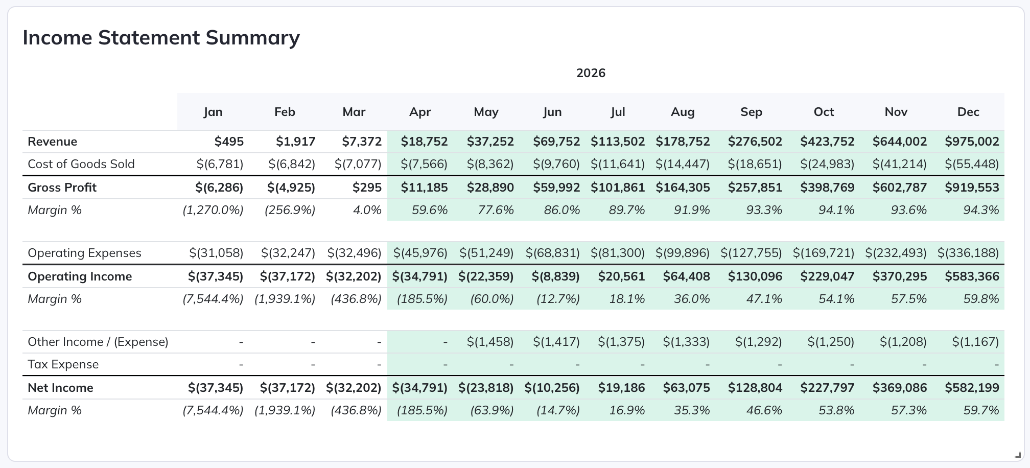
Like graphs, you can add a title and select the time period you want the Table to cover:
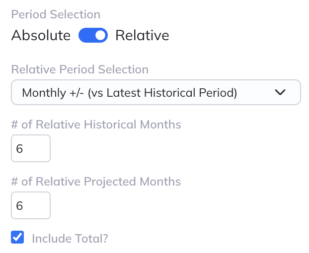
You can also choose whether or not to include a total column that sums all values for the selected timeframe (when relevant) using the "Include Total" checkbox.
The units selector chooses whether currency values in the Table are shown as stored, in thousands, or in millions. The Display Units set on the Configuration tab act as a floor: a company presented in thousands can show a Data Table in thousands or millions, and a company presented in millions shows it in millions.
Under "Table Rows" you can add data to your Table by clicking "+ Add Row":
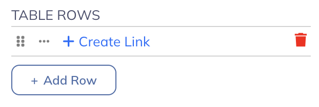
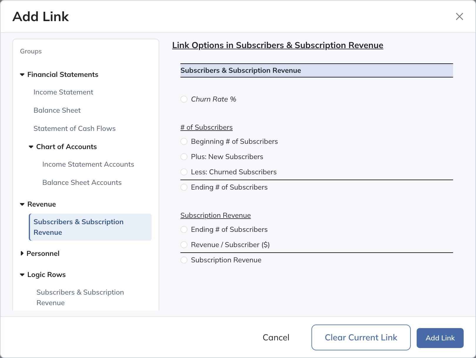
Creating links functions the same way here as it does for creating formulas on the Model tab. Clicking "+ Create Link" will open up the link creation screen:
Once you've created a link, the selected data will then be displayed in the Table:
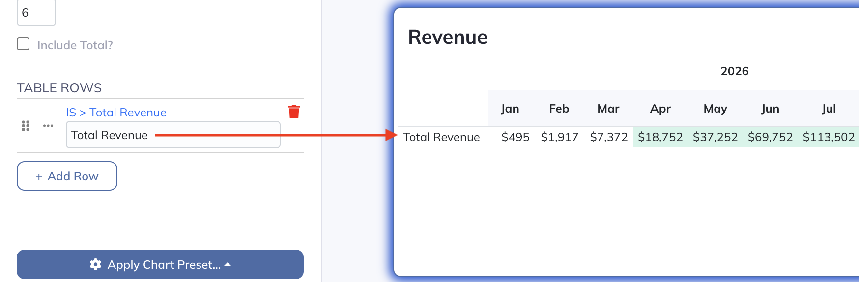
If you don't create a link for a given row in the Table, it will simply be displayed as a blank spacer row.
Reordering lines and modifying the line formatting also functions as it does on the Model tab by using the two icons on the left side of any row.
In the source picker, choose the global View, select the model row, and click Add Link. Save the report after reviewing its objects. The object’s Projection Set and period selections determine which values it displays. Display scaling on the reporting object changes presentation; it does not change model inputs.
Variance Objects
Variance Objects work very similarly to the Variance Analysis page. These objects allow you to incorporate a subset of your variance analysis into your reporting:
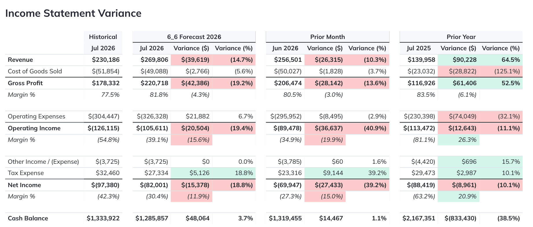
In these objects, you have the same functionality as you would in the Variance Analysis page. Selecting the "Edit Variance Options" button in the Edit Object panel will open a screen that looks like this:
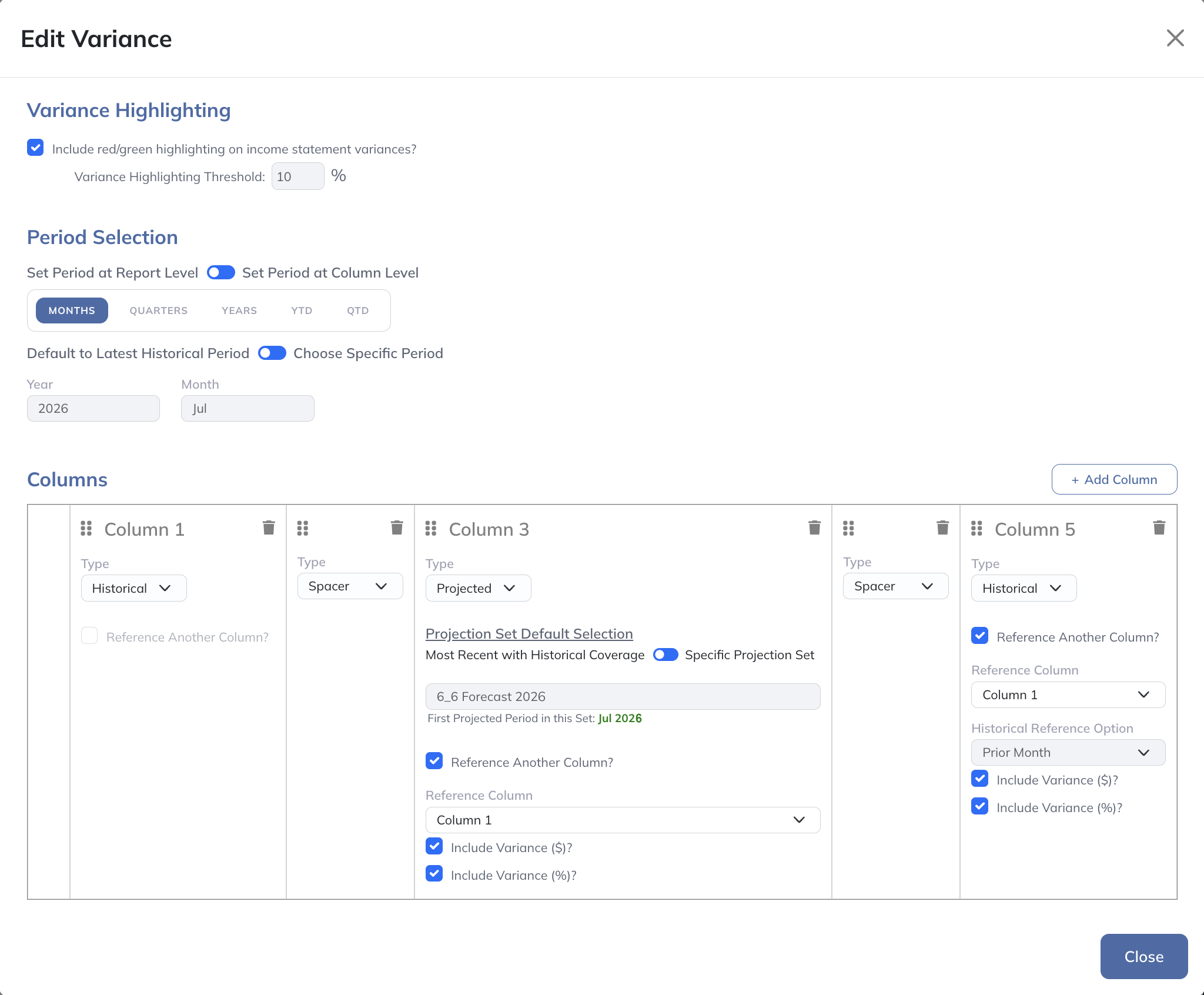
This functions the same way that editing report settings on the Variance Analysis page does, which is discussed in the Variance Analysis section of this guide.
Stagger Charts
A Stagger Chart allows you to see how your projections for a given account have changed over time and how they differ across Projection Sets:
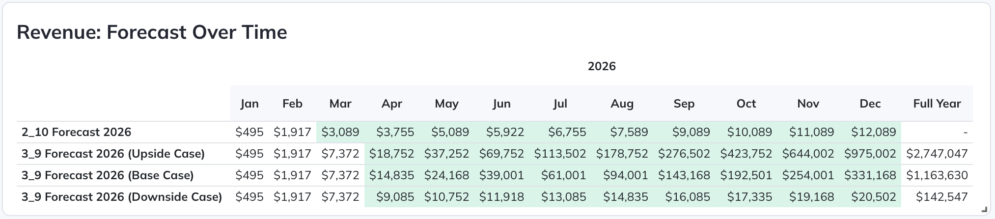
The periods with green backgrounds represent projected periods, and the periods with white backgrounds represent historical periods.
This is a great way to keep yourself accountable to your initial plans by clearly showing how your forecast has been adjusted over time.
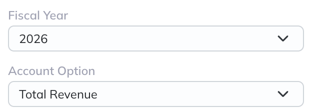
You first select which fiscal year you'd like to view (which will most often be the current year) along with the account of interest:
You then select the "Projection Set Comparison Method":
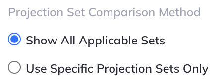
"Show All Applicable Sets" will insert one row in the Table for each Projection Set that has a start date in the selected year. With this option selected, newly created Projection Sets that meet this criterion will automatically be inserted over time.
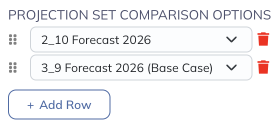
"Use Specific Projection Sets" will give you a Table where you can select whichever Projection Sets you'd like included in the Table:
Text Objects
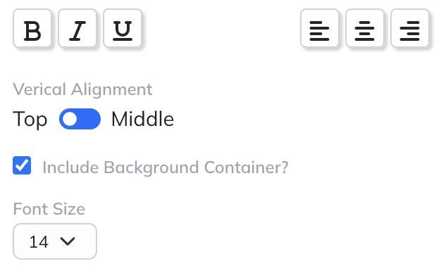
These objects enable you to add headers, section dividers, and commentary to your reports as desired.
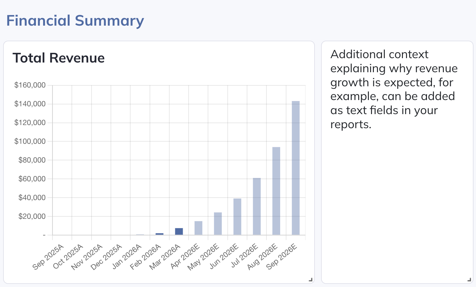
Several formatting and positioning options are available:
Data Tiles
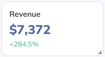
These objects enable you to highlight key data points:
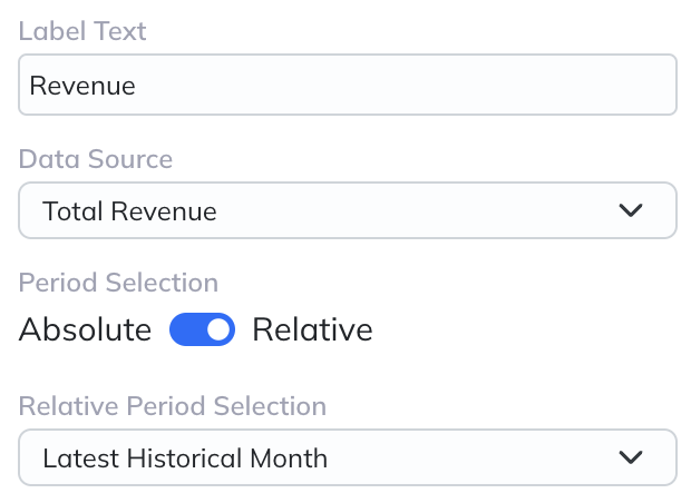
Simply give it a label, and select the data source and period:
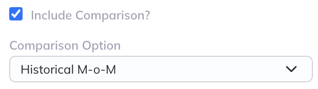
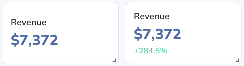
You can also optionally include a comparison option, which will show the percentage difference versus the selected Comparison Option: